Ingenious New Yorker cover


Saw this cover in the subway last week. It stopped me in my tracks.

Here is a close up. Isn't it ingenious?
It's a blurred version of that fabulous dandy Eustace Tilley with a scroll wheel on top of him indicating the universal message of 'page loading'. I thought sooo clever. The cover was done by reader Brett Culbert and was his entry to the magazine’s annual Eustace Tilley competition that has readers submit their own interpretations of the publication’s original 1925 cover illustration by Rea Irvin.
You can see the rest of the entries here:
Sure is alotta clever folks out there...

Press: Design Lines


The Winter Issue of Design Lines hit stores today!
It is beautifully designed as always by Melissa + Henry of Sali Tabacchi.
(Yes I'm biased:-))

The issue includes a big feature on paper goods made by Canadian artists. My silk screened Alphabet cards are included in the list. See below.

The list also includes great cards from Kid Icarus + Whigby. (who I adore!)
(Whigby is founded by the talented + funny Frank Viva. I will write a full post on him at some point!)

A close up of my Alphabet cards

Available at:
TYPE books
883 Queen St. West Toronto
and
Good egg
267 Augusta Ave. Toronto

ps. The issue also includes a feature on the gorgeous home of Paul Bain + Isa Spalding written by my friend Alison Garwood Jones. Way to go Alison.
pss. Look at that Paul Smith Rug. Soooo juicy. Also I love the painting over the sofa. It reads "Over the Sofa". Wish I thought of that.

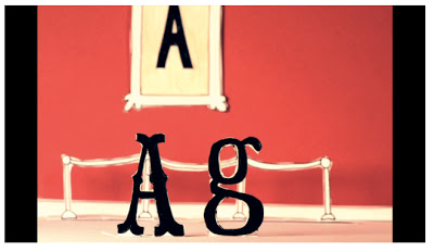
Inspiration: I'm Comic Sans Asshole


Really love this video by Joe Hollier that my friend Graeme sent along to me.
In it Comic Sans, (the most hated of typefaces) gets anthropomorphized + bad-assified.
Love the line "Sorry I'm standing in way of of your minimialist bauhausesque fascist snooze fest" and also "I’m the best thing to happen to typography since Johannes fucking Gutenberg."
The monologue was written by Mike Lacher’s and originally appeared in McSweeney’s.
So funny + inventive.