Manicules

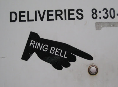
Nick Shinn's talk was great.
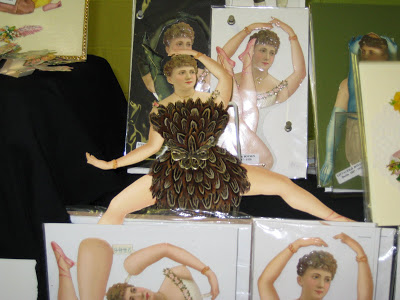
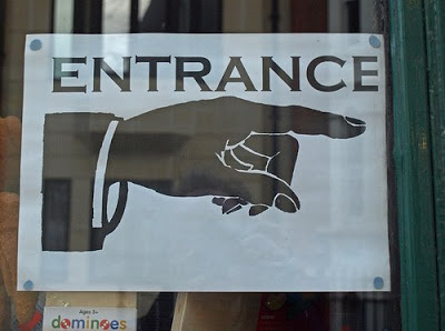
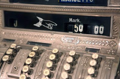
Among many items I learned that the Victorian pointing hands I've always liked have various names including a manicule and bishop's fist.
There is even a flickr group specifically for manicule watchers.
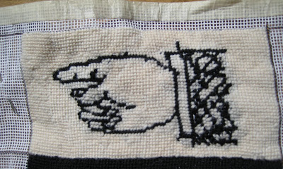
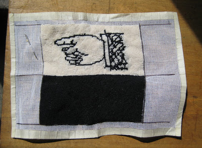
Speaking of... here's a photo of my completed manicule needlepoint.
When I sew the 2 sides together it'll be an eyeglass case.
NYC Day 4: DUMBO Flea market (+Paul Rand+ Bob Gill)
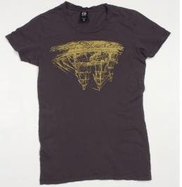
Whoo! This ship is upside down!! I thought a good metaphor for the economy right now.
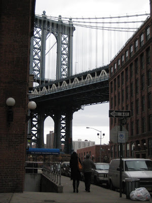
Went to DUMBO (Down Under the Manhattan Bridge Overpass) today for the weekend Flea Market.
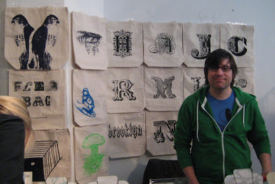
Amongst the "wares" I saw noticed a strong 'circus aesthetic' going on: lots of very ornate letters, and Victorian images with lots of swirlys. Here are 2 examples: the Brooklyn Flea bag and turned over ship tshirt both from Loyalty and Blood.
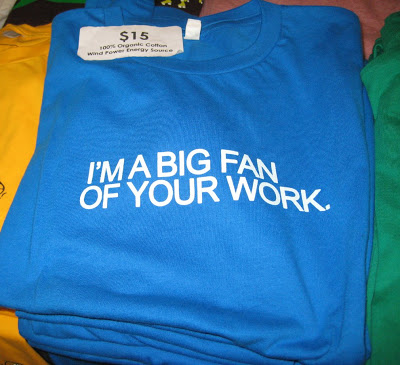
Also loved the very witty tshirts made by Brooklyn based Miss Wit.
Attached is my fave design:
(The expression is more LA than NYC but still quite great!)
Afterwards went wandering through a wonderful book shop on York St.
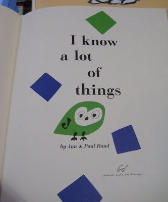
where the huge selection of kid's books were clearly chosen with their hipster designer parents in mind. Here are pics of two of my faves: I know alot of things by Paul Rand and
A balloon for Blunderbuss by Bob Gill. I love both these books. The illustrations are exceptional: simple yet very sophisticated.

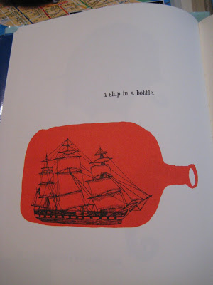
Love this ship!
Antiques: Chair Table Lamp + Kevin Austin
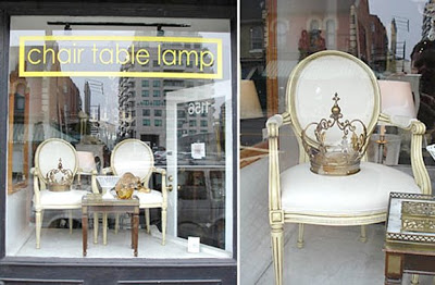
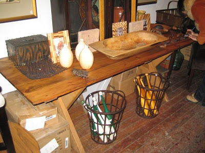
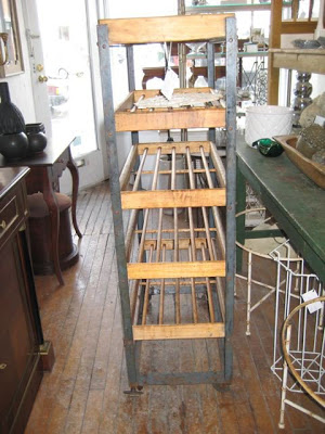

One of my favorite antique shops in the city is Chair Table Lamp at 1156 Yonge Street. It's owned by dealer/stylist Kevin Austin, who is also a frequent contributor to Style at Home magazine. Kevin buys alot of items which could fall under the term "Industrial chic" ie. pieces with lots of metal, well worn wood and a great patina. Below are photos from a recent visit. Favorite items included a beautiful old sawbuck table and some old bowling pins. The piece de resistance however was a metal + pine rack on wheels from an early 20C shoe factory. It was so quirky and worn in - I couldn't resist! The last photo shows the rack in it's new (temporary) home in my silk screen studio. In my ideal future I'd like to place it in my kitchen and display solid white dishes on it for a great contrast. ooh ahh.
wow: Louise Fili's apt
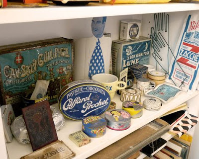
The apt of graphic designer Louise Fili was featured on Design Sponge today. Quite to die for (and you can certainly see where she gleans her inspiration for her wonderful restaurant graphics and packaging)
I loved everything but especially this shot of a color-coded shelf in her office with flea market finds from Italy + France. Love the tins and that guy with the realistic face and very graphic tie.
Sigh.
