SFgirlbythebay: Modern Bohemian Style

I have recently started to subscribe to the very popular blog SFgirlbythebay by Victoria Smith and opening up the post each morning is like unfolding a dense + juicy jewel (I know weird metaphor!) that leads to many other inspiring people + worlds.
For eg. this morning she features the home of UK stylist + writer Emily Chalmers which is jammed packed with inspiration + fleamarkety goodness. (see above!)
Highly recommended.
ps. Victoria has been enthusiastically blogging since 2006 and is a fellow contributor to uppercase magazine.
Coming soon to a TV near you

This week a crew from Holiday Films came by and rented several of my prints plus my inspiration board above for a tv commercial.
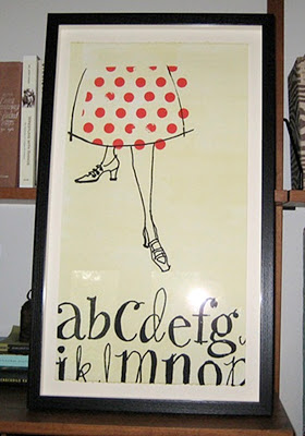
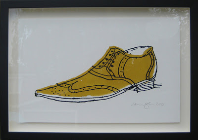
My Alphabet legs + Big Brogue shoe print which will appear in the commercial.
The spot was shot by Director Lena Beug (you can see her fantastic demo reel here)
with art direction by the talented Greg Keen + prop styling by the lovely Nancy Machel.
It was great to work with all of them.
I'll post a video of the commercial when it's released.
Little Home Reno update + Some thoughts on Colour

We started with this....

and now it's lookin' like this
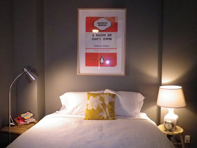
I know i know... it looks like my last bedroom!
Walls are Ben Moore Chelsea grey
Pillow by Judy Ross
Ok so it has been ages since I posted a reno update so here's a peek at what's been going on Chez Alanna. I put in two walls to create a private bedroom and a large vestibule. Painted the bedroom Ben Moore Chelsea grey as usual and got a new bed! Next step is to get an upholstered headboard which I'm hoping will pull the room together.

Isn't this stunnning?! LOVE the mustard headboard.
I was gonna go very neutral with the headboard in a nice grey in felt or linen but after seeing the beautiful photo above i'm inspired to do the headboard in a fun colour that will really pop off the grey walls. Am thinking either a mustard as in the Judy Ross pillow or my all time favourite colour: limey chartreuse.
*Dear Readers - Your feedback is most welcome in this serious matter.*
(Please note the irony of that statement)
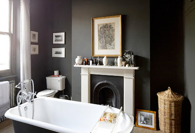
Now that's a grey!
Photo from the marion house book
Colour note: The Chelsea grey is ok but am now wishing I'd gone with a more dark slatey grey like in the dreamy photo above. I think the paint might be Farrow and Ball's Down Pipe.
Looks much better huh?
I say Learn from my mistakes Dear Readers!
ps. I very much wish I didn't have a mind that obsessed about colour so much... but alas I do.
and pss. I found the bathroom photo on a great new blog The Marion House Book which is written by an Exhibit/ Interior designer and fellow West - Ender Emma Reddington. Emma has really great style - reminiscent of what one finds in the British Decor mags like Living etc + Elle Decor UK plus... she loves greys + blacks! Highly recommended.
(Thanks Kim for turning me onto Emma!)
IDS 11 Opening Night Party

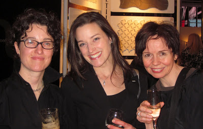
Janet, Jennifer, and me
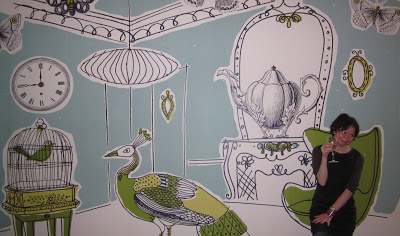
Me goofing around in front of my mural which I created for the Style at Home booth

More goofing with Margot Austin


The lovely Arren Williams with a fabulous orange pocket square
and one half of the talented Brothers Dressler duo.
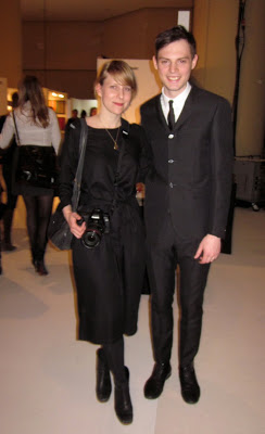
John + Julie from Mjolk (what a gorgeous couple!)


Erin McLaughlin, Kevin Austin, and Vanessa Bottoni at the very colourful Style at Home Booth

and the wonderful + always dapper Tommy Smythe.
Just love those tortoise shell glasses.
The IDS Opening Night Party tonight was a complete blast.
Highlights included checking out the booths with pals Kim, Jenn, and Janet, enjoying the Thompson Hotel's mac and cheese, (yum) admiring Arren William's orange pocket square, goofing around with Margot + Kevin Austin and meeting Tommy Smythe.
ps. I will write a post on the process behind creating the mural in the next few days.
