Book Designer David Drummond


The stolen l = brilliant.


Here's the entire series.
Love the level used to signify wellbeing. So clever.


The process of creating this cover is documented on his blog.

David Drummond is top notch book designer known for creating very clever covers with an economical style. He limits himself to four fonts: New Baskerville, Helvetica, Trade Gothic and Futura. His blog is full of interesting details from his design process + great pictures of his office in rural Quebec.
In an interview with Chris Tobias, Drummond attributes the intelligent and subtle humour he brings to his work to the reading of the book A smile in the Mind by Beryl McAlhone and David Stuart.
(I am keen to learn what secrets lurk inside these pages - the book is on it's way from Amazon!)

Design Inspiration


Beautiful poster by Design studio Heads of State which was influenced by the work of 1940s record pioneer Alex Steinweiss.


Stills from wonderous film titles created by Saul Bass.
Great use of contrast and such a sense of whimsy.
What a Master!!

I've already featured this book but it bears repeating.
Highly recommended.


Two great Rand book covers.

Began work on the poster today.
Step 1 = Flipping through my typography and book design books. New Vintage Type, Paul Rand, A Mano and Masters of Poster Design are four reference books that keep close by at all times.
The design studio Heads of State, Saul Bass and Paul Rand were very inspirational as always.
All are wonderous at contrasting textures and producing a simple elegant solution.
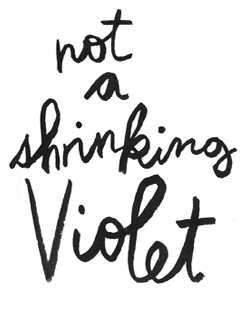
Inspiration: Beautiful handwritten Type


I got an assignment for a poster full of handlettered type today so have begun the process of gathering inspiration.
Found this beautiful hand written note from a site which highlights some of Jane Campion's documentation from the making of her film Bright Star. I love the crease of the envelope, and the big H and the d curling back on Hampstead... but most of all I like the ink blobs on the E.