As promised here is a peek at the process behind the Style at Home mural.
1. Margot Austin requests a fanciful image with a "Dorothy Draper-meets-Alice-in-Wonderland" vibe. The piece must be created using colours in the Style at Home Beautitone paint series. Suggests the Anthropologie catalogue for inspiration.
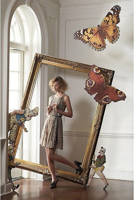
2. The Anthropologie catalogue is hugely inspiring. Filled with wonderous images which combine photographs of the models with Victorian toys, overscale props, whimsical chickens and sheep! Really amazing.
(FYI The Design cognescenti suspect that Tim Walker is behind the catalogue)
Am now inspired to combine my illustration with some Victorian Advertising cuts for an extra surreal dimension.

3. Research Dorothy Draper. This is one of the hotels she designed.
See this blog post.

4. After doing lots of sketches I scan my drawings plus some images from a catalogue of 19C Advertising cuts and put the image together in Photoshop.
Above is one of several sketches sent.
I liked the little Victorian man with the bowler hat chatting to the peacock. :-)
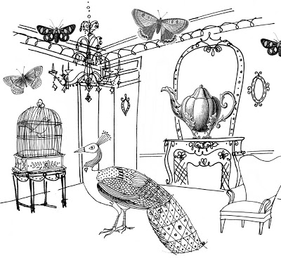
5. The team chooses this sketch but requests that I change the chandelier to a George Nelson bubble lamp and the old chair to an Arne Jacobson Egg Chair for a fun new + old mix.

6. I carry out the revisions plus also add a clock because I am a perfectionist.
This revision is approved. Ready to move onto colour.

7. I scan in all the paint chips. I then use the eye dropper in Photoshop to grab the hue and bring it into my illustration.

I chose to use a limited palette of blues + greens because this usually gives a more sophisticated look. The paint chip names are Wasabi, Pool, Trinity Blazer and Viburnum.
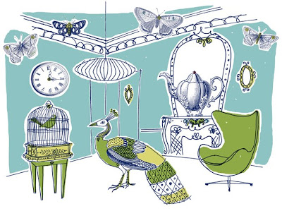
10. The team liked the 'colour family' but asked for me to switch around some colours.
Above is the Final approved image.
11. I then converted the file from RGB to CMYK and sent it off to the printer Pierre at Mural Unique where he did a great job of scaling it to 12.6 feet X 10 feet and then printing it out onto wallpaper strips.
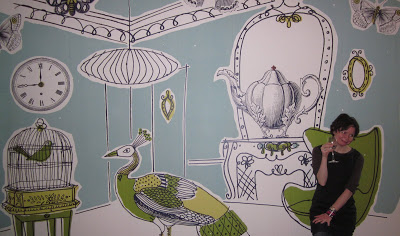
12. Ta da.
1. Margot Austin requests a fanciful image with a "Dorothy Draper-meets-Alice-in-Wonderland" vibe. The piece must be created using colours in the Style at Home Beautitone paint series. Suggests the Anthropologie catalogue for inspiration.

2. The Anthropologie catalogue is hugely inspiring. Filled with wonderous images which combine photographs of the models with Victorian toys, overscale props, whimsical chickens and sheep! Really amazing.
(FYI The Design cognescenti suspect that Tim Walker is behind the catalogue)
Am now inspired to combine my illustration with some Victorian Advertising cuts for an extra surreal dimension.

3. Research Dorothy Draper. This is one of the hotels she designed.
See this blog post.

4. After doing lots of sketches I scan my drawings plus some images from a catalogue of 19C Advertising cuts and put the image together in Photoshop.
Above is one of several sketches sent.
I liked the little Victorian man with the bowler hat chatting to the peacock. :-)

5. The team chooses this sketch but requests that I change the chandelier to a George Nelson bubble lamp and the old chair to an Arne Jacobson Egg Chair for a fun new + old mix.

6. I carry out the revisions plus also add a clock because I am a perfectionist.
This revision is approved. Ready to move onto colour.

7. I scan in all the paint chips. I then use the eye dropper in Photoshop to grab the hue and bring it into my illustration.

I chose to use a limited palette of blues + greens because this usually gives a more sophisticated look. The paint chip names are Wasabi, Pool, Trinity Blazer and Viburnum.

10. The team liked the 'colour family' but asked for me to switch around some colours.
Above is the Final approved image.
11. I then converted the file from RGB to CMYK and sent it off to the printer Pierre at Mural Unique where he did a great job of scaling it to 12.6 feet X 10 feet and then printing it out onto wallpaper strips.

12. Ta da.
